Are People Really Seeing a Hidden Smile in the Coca-Cola Logo? A Deep Dive Into Design, Psychology, and Brand Perception
Few brand marks in the world are as instantly recognizable as the flowing red-and-white script of Coca-Cola. For more than a century, this elegant wordmark has appeared on bottles, billboards, vending machines, and storefronts across the globe. It is one of the most studied and discussed logos in marketing history.

Recently, however, a new conversation has gained traction online. Some observers claim they’ve discovered a “hidden detail” within the Coca-Cola logo—specifically, that the second “C” in “Coca-Cola” subtly resembles a smiling face. According to this theory, the curve of the letter looks like a friendly grin. Once someone points it out, many people say they can’t unsee it.
But is there truly a hidden smile in the Coca-Cola logo? Was it intentionally designed to convey happiness? Or is this simply an example of the human brain finding patterns where none were planned?
In this in-depth article, we’ll explore:
-
The origin and evolution of the Coca-Cola logo
-
The design style used in the original wordmark
-
Why some people see a “smile” in the lettering
-
The psychology behind pattern recognition
-
How brand perception shapes interpretation
-
Why logos can gain new meanings over time
By the end, you’ll understand not only the story behind the Coca-Cola logo, but also why this “hidden smile” theory feels so convincing to many viewers.
The Global Recognition of the Coca-Cola Logo
Before examining the smile theory, it’s important to appreciate the cultural status of the Coca-Cola wordmark.
Since its introduction in the 19th century, the Coca-Cola logo has remained remarkably consistent. While minor refinements have occurred over time, the flowing cursive style is largely unchanged. It’s a rare example of a brand identity that has maintained continuity for well over 100 years.
The distinctive script has become synonymous with:
-
Celebration
-
Refreshment
-
Community
-
Familiarity
-
Tradition
Because the logo is so deeply embedded in global culture, even small visual details attract attention.
The Origin of the Coca-Cola Logo
The original Coca-Cola wordmark was created in 1886 by Frank Mason Robinson, a bookkeeper and business partner involved in the early days of the company.
Robinson selected a writing style known as Spencerian script—a popular cursive handwriting style in the United States during the late 19th century. Spencerian script was widely used for business correspondence and formal writing before typewriters became common.
The design choice reflected:
-
Elegance
-
Professionalism
-
Legibility
-
Period-specific aesthetic standards
There is no documented evidence that Robinson intended to embed hidden symbols, emotional cues, or subliminal imagery in the lettering. His focus was on creating a distinctive and attractive brand name presentation.
Understanding Spencerian Script
Spencerian script features:
-
Flowing curves
-
Extended loops
-
Decorative flourishes
-
Balanced proportions
The exaggerated curves of the letters were typical of handwriting instruction during that era. What modern viewers might interpret as artistic symbolism was simply standard penmanship at the time.
This context is crucial. Without understanding historical typography, it’s easy to project modern design thinking onto a 19th-century aesthetic.
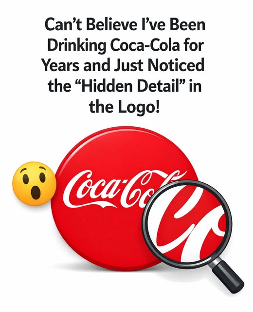
The “Hidden Smile” Theory Explained
The recent online theory centers on the second “C” in “Coca-Cola.”
Observers claim that:
-
The upper curve of the letter resembles a curved smile.
-
The stroke flows outward before turning downward.
-
The shape gives the impression of a friendly grin.
Some suggest that if the curve were slightly more upward, it would clearly resemble a smiling mouth.
When viewed through this lens, the logo appears to contain a subtle emotional cue—almost as though the brand itself is smiling at the viewer.
But was this intentional?
Is There Evidence of Intentional Design?
There is no historical documentation indicating that the Coca-Cola logo was designed to resemble a smiling face.
No early branding materials mention:
-
Emotional symbolism in the letterforms
-
A deliberate smile motif
-
Hidden imagery
Additionally, Coca-Cola has not officially confirmed that the “smile” interpretation was planned.
Given the time period in which the logo was created, it is far more likely that the curves reflect stylistic conventions rather than emotional symbolism.
Why Do So Many People See a Smile?
If the smile wasn’t intentional, why does it feel so real to many viewers?
The answer lies in psychology.
Pareidolia: The Brain’s Pattern-Seeking Ability
Humans are naturally wired to recognize faces and emotional expressions. This tendency is known as pareidolia—the phenomenon of perceiving familiar patterns (especially faces) in random or unrelated visual stimuli.
Examples of pareidolia include:
-
Seeing shapes in clouds
-
Noticing faces in electrical outlets
-
Interpreting car headlights as “eyes”
Once someone suggests that a certain shape resembles a face, it becomes difficult not to see it that way.
The Coca-Cola “smile” may be a classic example of this cognitive pattern recognition at work.
The Role of Brand Identity
Another reason the smile theory resonates is that it aligns perfectly with Coca-Cola’s long-standing brand image.
Over decades, Coca-Cola advertising has emphasized themes such as:
-
Happiness
-
Sharing
-
Celebration
-
Friendship
-
Optimism
When a brand consistently promotes joyful messaging, people may unconsciously associate visual elements with positive emotions.
Thus, seeing a “smile” in the logo feels natural because it matches the brand’s personality.
The Evolution of Meaning Over Time
Designs are not static in their interpretation. Even if the original intent was purely stylistic, meaning can evolve.
As decades pass:
-
Cultural associations change
-
Marketing messages shift
-
Audiences reinterpret visuals
A flourish drawn in 1886 may take on symbolic meaning in 2026—even if none was originally intended.
Logos become living symbols shaped by public perception.
The Dynamic Ribbon and Later Design Additions
In 1969, Coca-Cola introduced the “Dynamic Ribbon Device,” a flowing white wave beneath the lettering. This addition reinforced the sense of movement and fluidity.
Although separate from the smile theory, it further enhanced the logo’s sense of energy and warmth.
Over time, the logo has been modernized subtly, but the core script remains intact—testament to its enduring appeal.
Why the Smile Interpretation Feels Convincing
Several factors contribute to the popularity of the hidden smile idea:
1. Simplicity of the Shape
The curve is smooth and rounded—characteristics commonly associated with friendliness.
2. Cultural Context
Modern branding often uses subtle design elements to evoke emotion. Today’s audiences may assume similar strategies were used historically.
3. Social Media Amplification
Once a visual theory gains traction online, repetition reinforces belief.
4. Emotional Projection
Consumers project feelings onto brands they associate with positive memories.
The Power of Familiar Logos
The Coca-Cola logo has been displayed on:
-
Vintage glass bottles
-
Retro metal signs
-
Holiday advertising campaigns
-
Sporting event sponsorships
Its visual familiarity makes even minor reinterpretations feel significant.
When something so iconic appears to reveal a hidden layer, curiosity naturally spreads.
Are Hidden Details Common in Logos?
Some logos do intentionally contain hidden elements.
For example:
-
The arrow in the FedEx logo between the “E” and “x.”
-
The hidden bear shape in the Toblerone mountain graphic.
Because hidden symbolism exists in other brand marks, people may assume similar techniques were used in the Coca-Cola design.
However, historical evidence does not support that conclusion here.
The Emotional Impact of Curves in Design
Design research suggests that curved shapes tend to feel:
-
Softer
-
More welcoming
-
Less aggressive
Sharp angles often convey strength or intensity, while curves feel friendly and approachable.
The Coca-Cola script, filled with flowing curves, naturally evokes warmth—even without hidden imagery.
Nostalgia and Perception
Coca-Cola’s branding is strongly associated with nostalgia. Holiday campaigns, vintage advertising, and collectible memorabilia reinforce sentimental connections.
When people feel nostalgic, they are more likely to attribute positive meaning to visual details.
Thus, the “smile” interpretation may reflect emotional association rather than design intention.
The Broader Lesson About Design Interpretation
The hidden smile theory illustrates a broader principle:
Design meaning is co-created between creators and audiences.
Even if the designer did not intend a specific symbol, viewers can still experience meaningful interpretations.
Logos are powerful not just because of what they depict—but because of what people feel when they see them.
Does It Matter If It Was Intentional?
Interestingly, whether the smile was intentional may not matter.
If people perceive warmth, positivity, and friendliness in the logo, then the brand benefits from that interpretation regardless of original intent.
Perception often carries as much influence as documented history.
The Enduring Strength of the Coca-Cola Wordmark
More than 130 years after its creation, the Coca-Cola logo remains:
-
Recognizable
-
Consistent
-
Emotionally resonant
-
Culturally significant
Few logos achieve such longevity without major redesigns.
Its simplicity may be the key to its adaptability.
Final Thoughts: Smile or Coincidence?
So, is there truly a hidden smile in the Coca-Cola logo?
Historically speaking, there is no evidence that the second “C” was intentionally crafted to resemble a grin. The curves are consistent with Spencerian penmanship and 19th-century design norms.
However, the fact that so many people see a smile speaks to:
-
The human tendency toward pattern recognition
-
The emotional power of branding
-
The evolving meaning of visual symbols
Whether coincidence or creative reinterpretation, the idea of a smiling letter adds another layer of fascination to one of the world’s most iconic logos.
The next time you glance at the Coca-Cola script, you might see nothing more than elegant handwriting. Or you might notice that subtle curve and feel like it’s offering a friendly expression.
Either way, the discussion itself proves how powerful thoughtful design can be—long after its original creators put pen to paper.